
Gartner, Inc. / Software Advice
Software Advice is an Austin, Texas based technology company that gives guidance to potential software buyers through reviews & research on thousands of software platforms. They achieve this through a dedicated marketing group that creates original content as well as an advisory team (seen above) that provides telephone consultations to help potential software buyers make their choice. An example of the software categories include: CRM, ERP, CMMS, BI, HR, and others. Software Advice is owned by Gartner (NYSE: IT), the world's leading information technology research & advisory company.
Anatomy of a Content Hub

Working closely with Taylor Stockwell for direction, and Rob Hoyt for development & UI/UX concerns, it was my responsibility to make all visual assets for this massive project. I created wireframes and mockups for every single visual design aspect of the entire project related to spacing, imagery, typography, button states, roll overs, and responsive implementation.
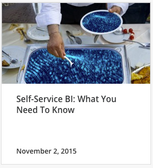
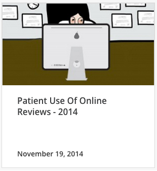
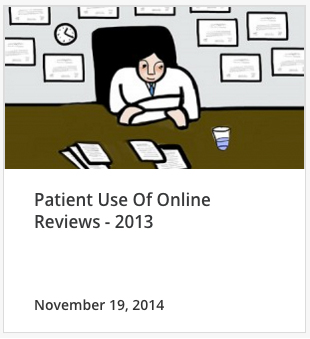
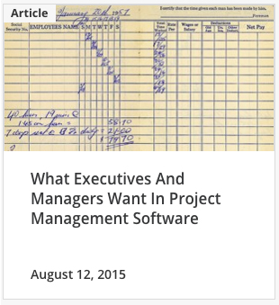
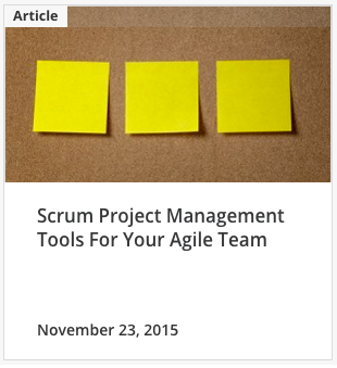
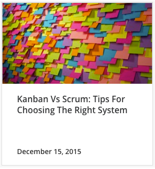
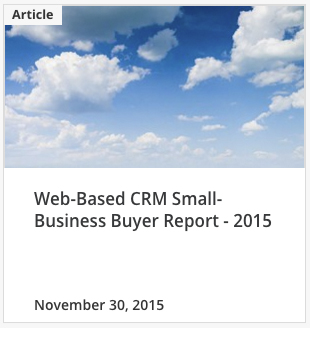
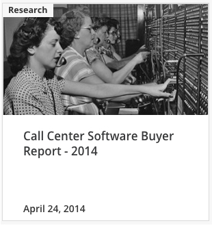
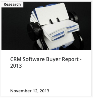
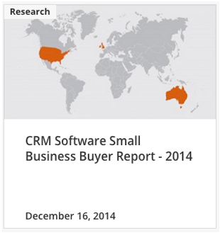
The backend of the Content Hub runs on Wordpress, using the Essential Grid plugin through Foundation. In the image below you can see the 'Landing Page Tiles' featuring images at 450px x 245px, creating a consistent visual reference for the user. Content type is highlighted in the upper left corner of each time with a small white knocked out rectangle. The title of the Article was limited to a character count to not break the grid, and responsive parameters kept the text at the correct size depending on if the user was on a desktop/ipad/mobile device.
In addition to building the look/feel of the site, other responsibilities included close collaboration to improve the navigation, bread crumbs, drop downs, and the use of filters to improve the UI/UX.
Landing Pages


Content Tiles
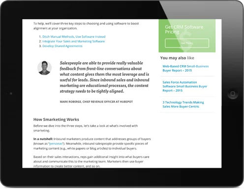
In order to draw users into the content funnel, a strong visual voice was constructed through imagery. Drawing from work done during my masters studies, I was able to create a clear visual art direction, with images that would help tell the story for the users. Considerations were made regarding visual style (photography, illustration, icons, vectors) and these assets were created with budget in mind as well as the capacity to scale up with the increasingly fast content publishing workflow. Seen below is a sample of the content hub and the visual style overseen either directly by me, or under my direct art direction.


In certain instances the landing page tiles needed to function for multi section content (example below). When these situations arrived, a global system was created and added to the style guide.

An extensive set of rules were created for how to handle image selection. Photography that was not staged or felt like 'stock photography' was favored. For a more complete list of these rules please see Brand Guidelines at the end of this page.

Quote Styles for Responsive Web
All typography on the hub is built to function across multiple platforms. The block quote styles were designed for maximum impact and legibility, and were mocked up for desktop, ipad, mobile browsers in both vertical and horizontal formats.

Global Content Templates
One of the most important projects I worked on was the creation of a set of custom templates that could be used by the Publishing department so that they could produce quality designed content in a scalable manner. The first phase of this project was to create a master system of sketches (seen below).

Horizontal Icon Templates
Orbiting Icon Charts
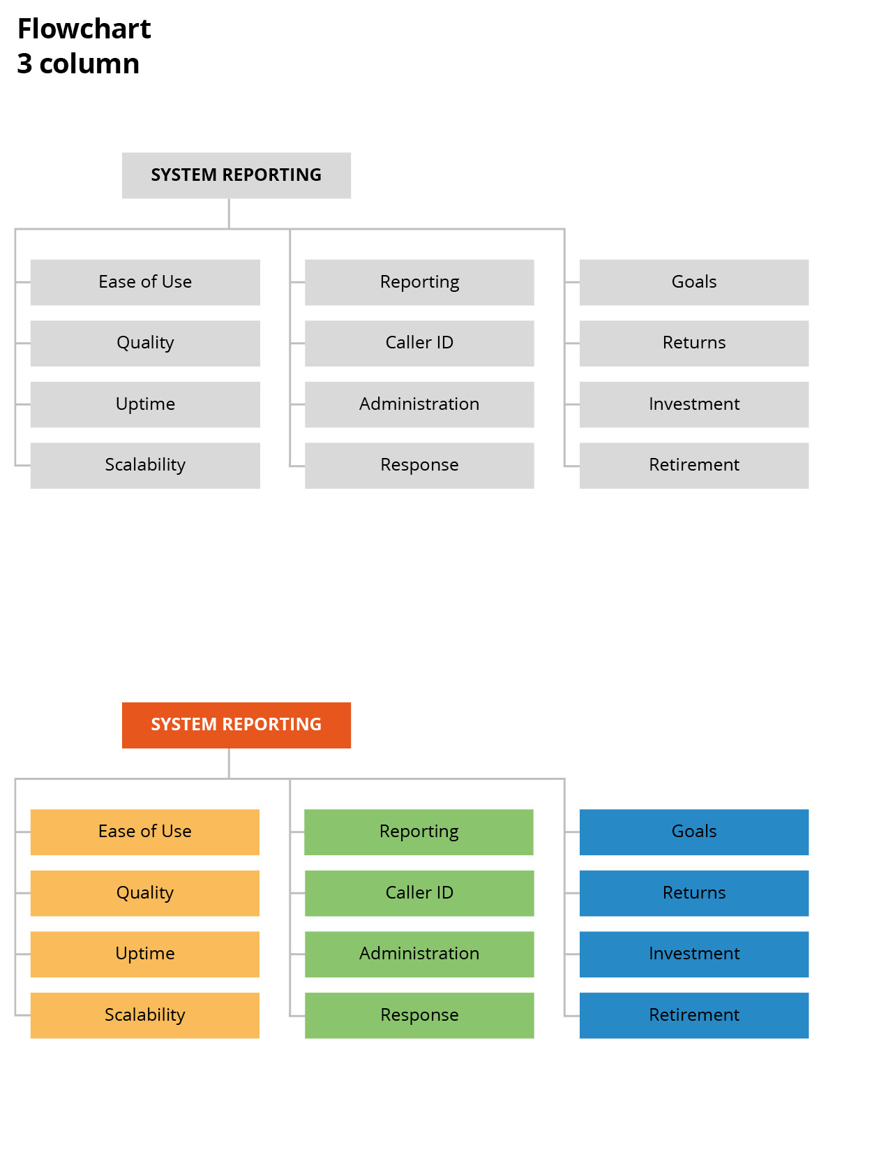
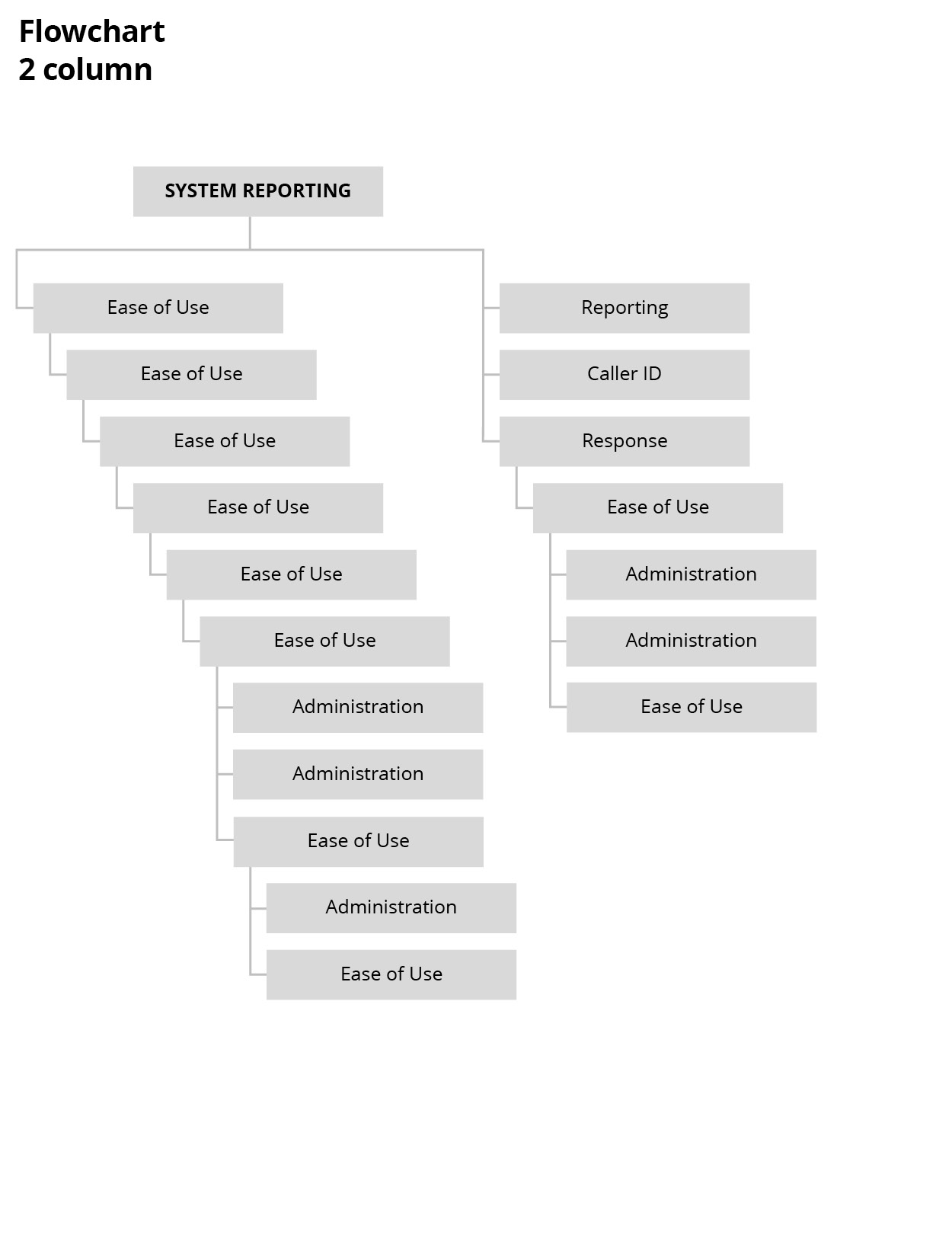
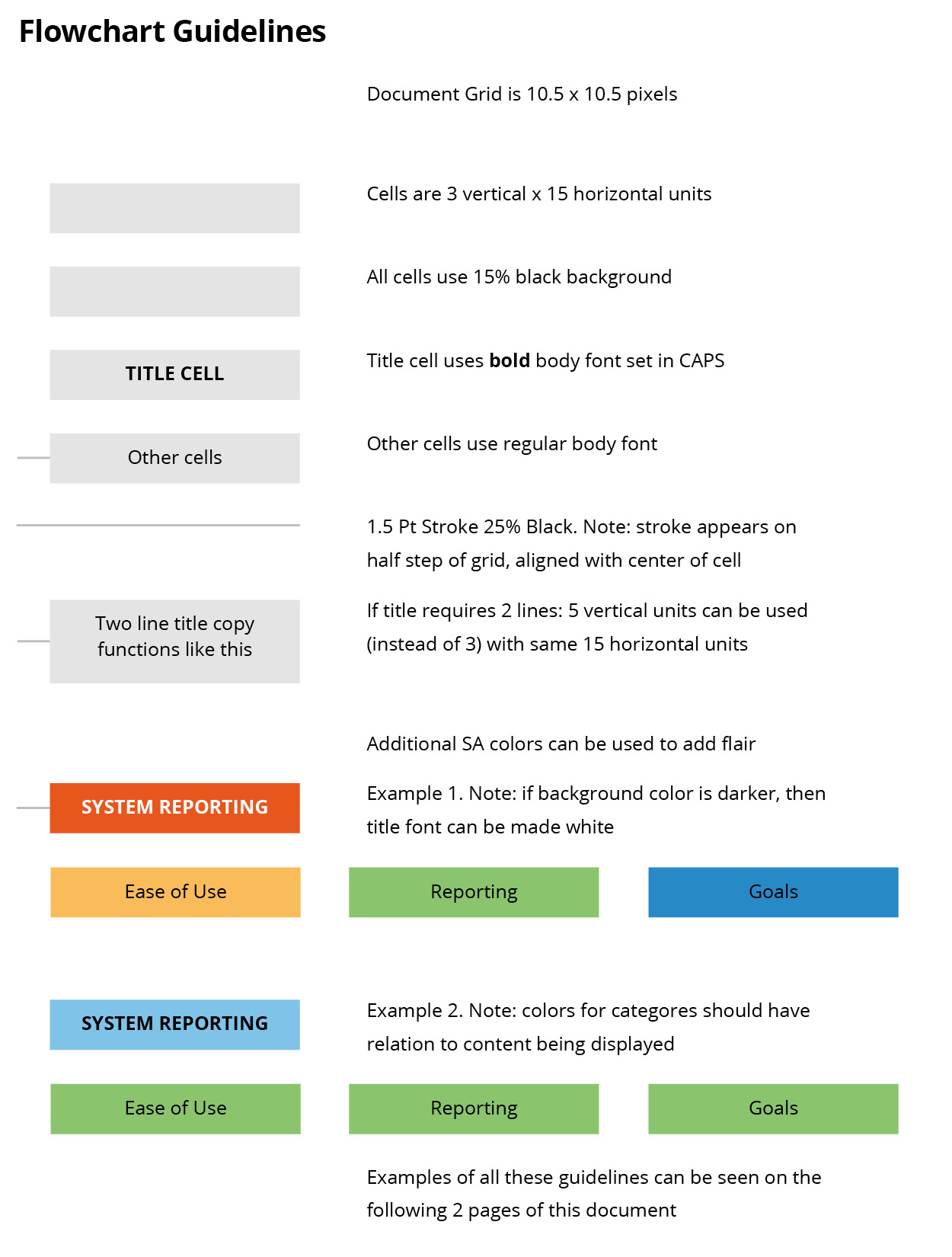
Flowchart
Several forms of flowcharts were developed as well as a usage guidelines (image below right).
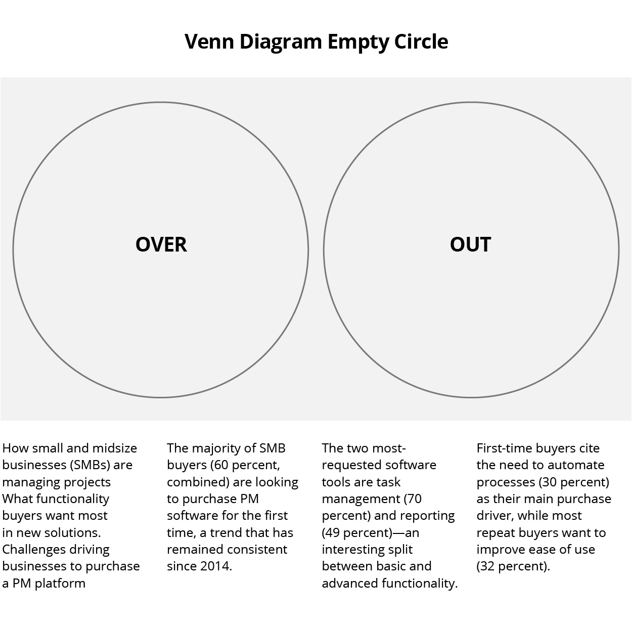
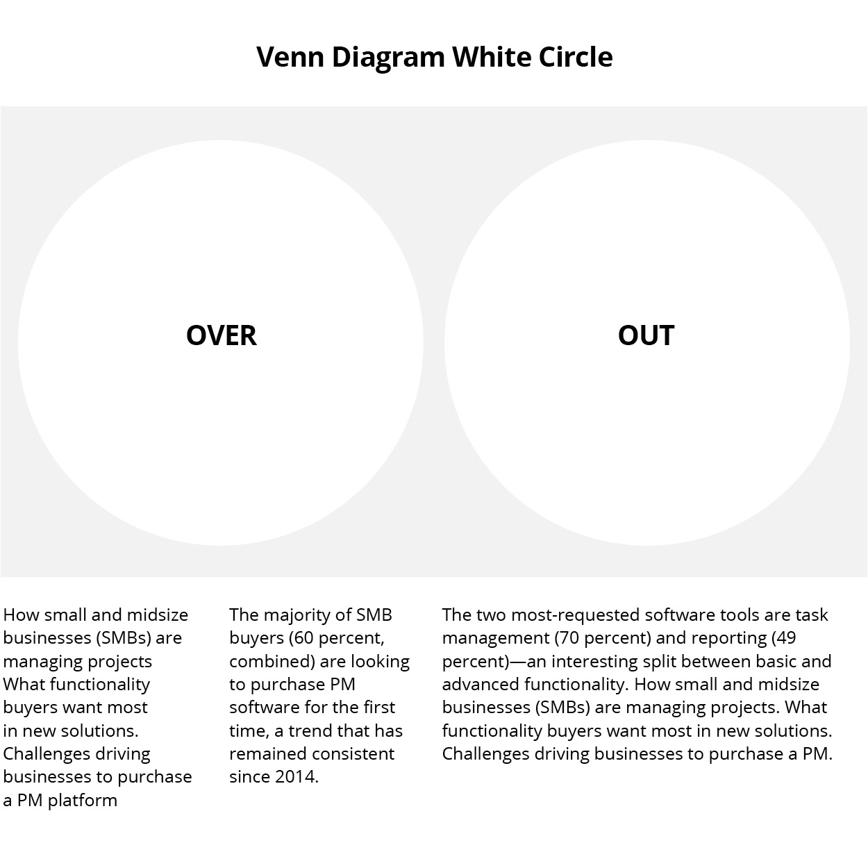
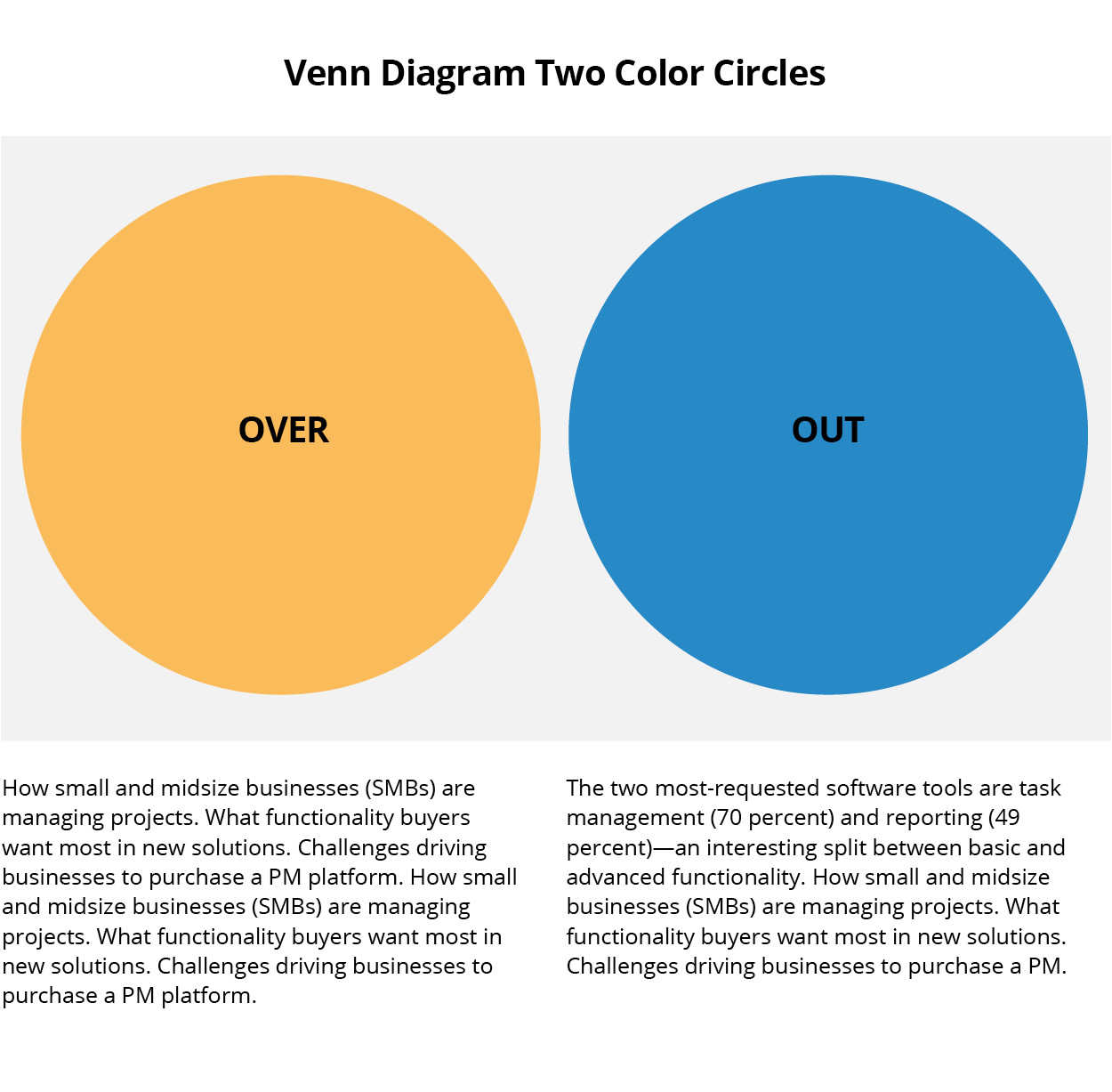
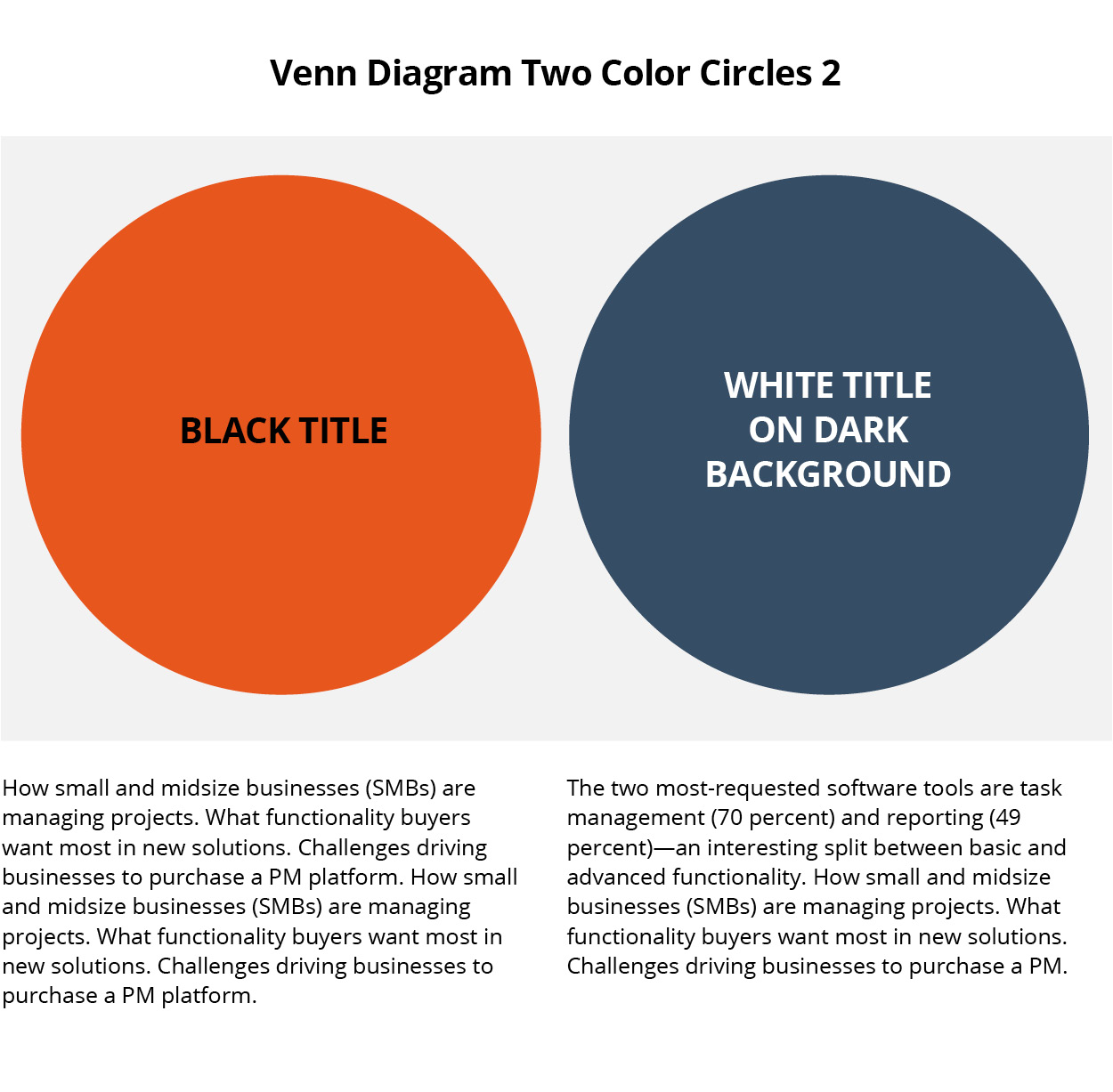
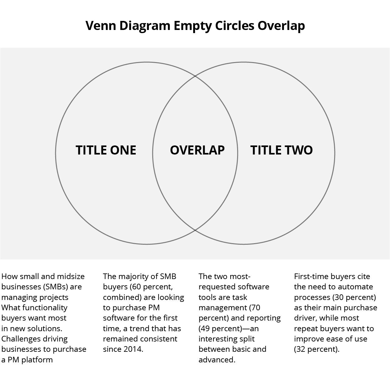
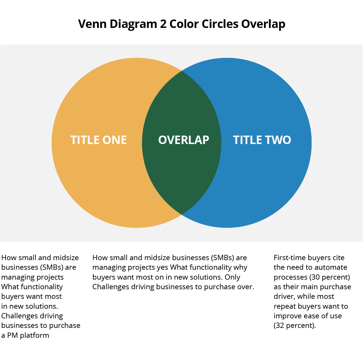
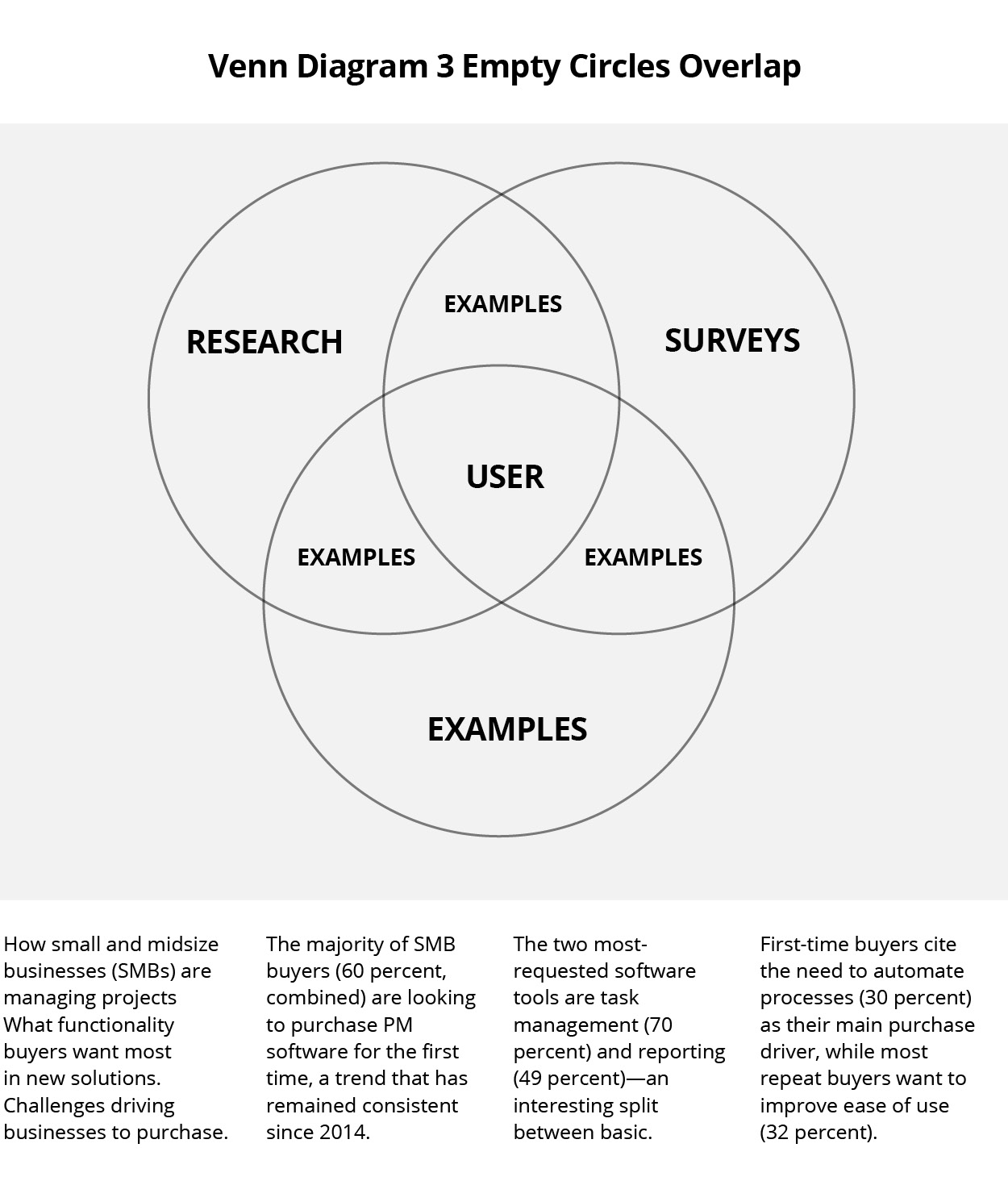
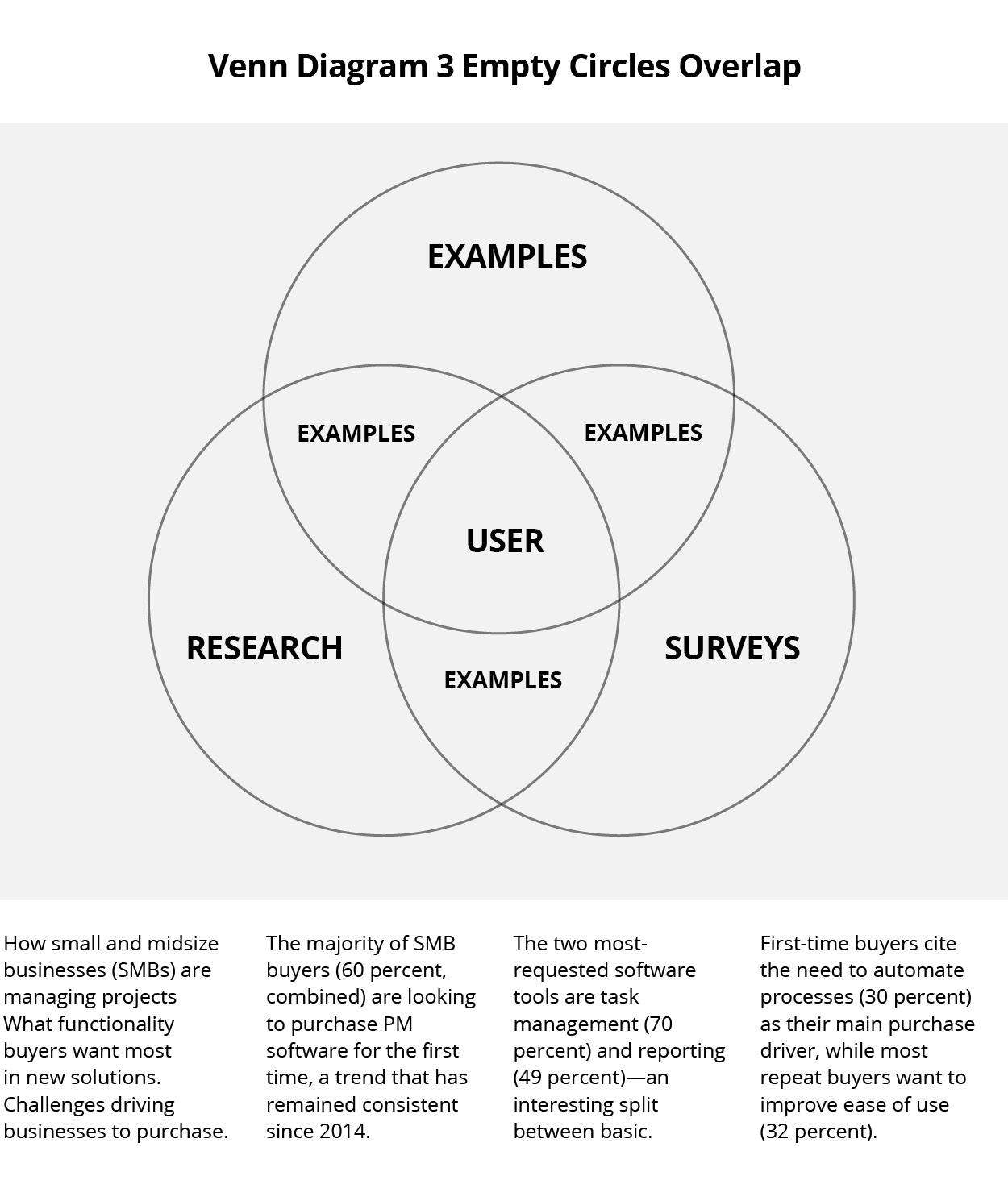
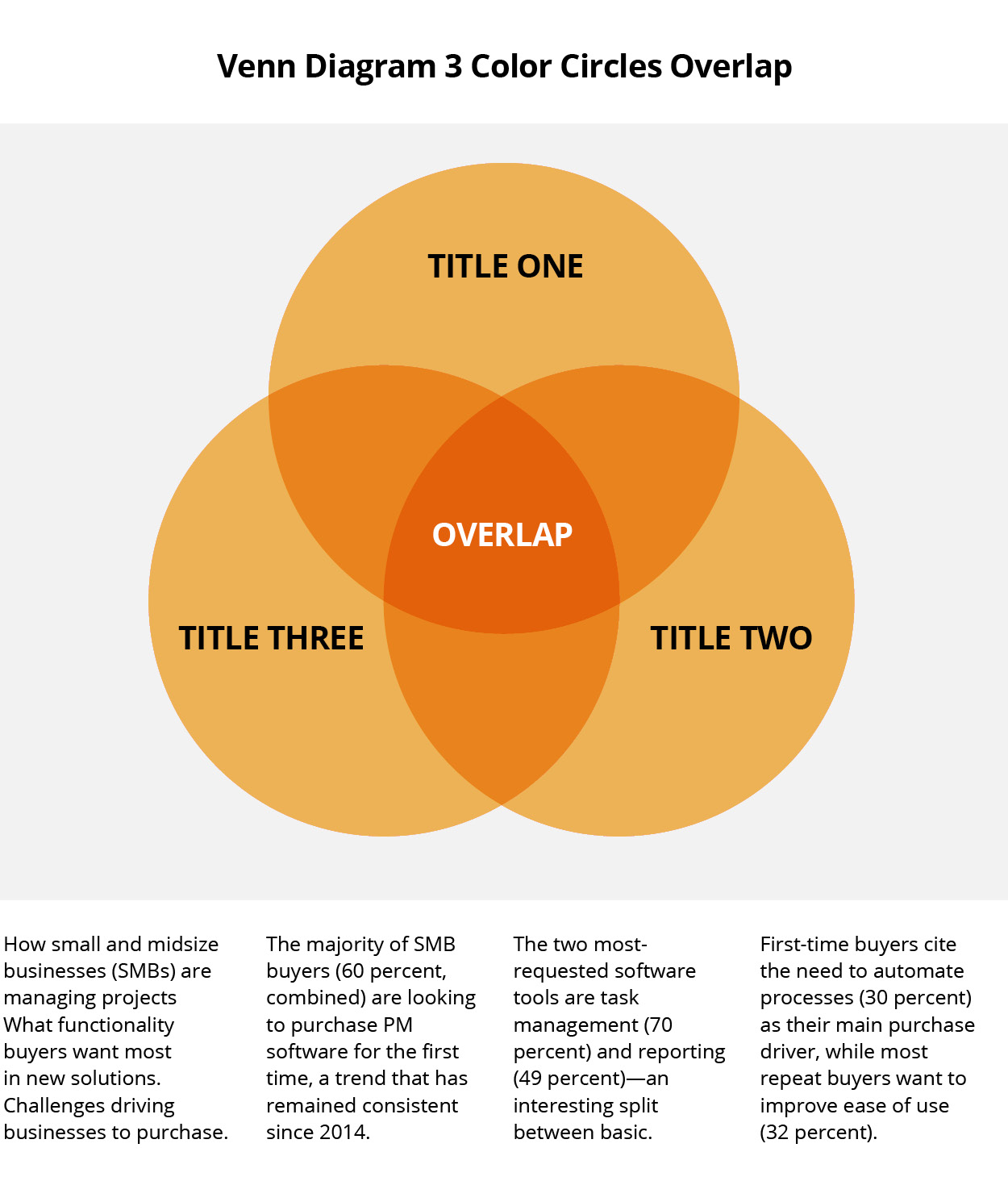
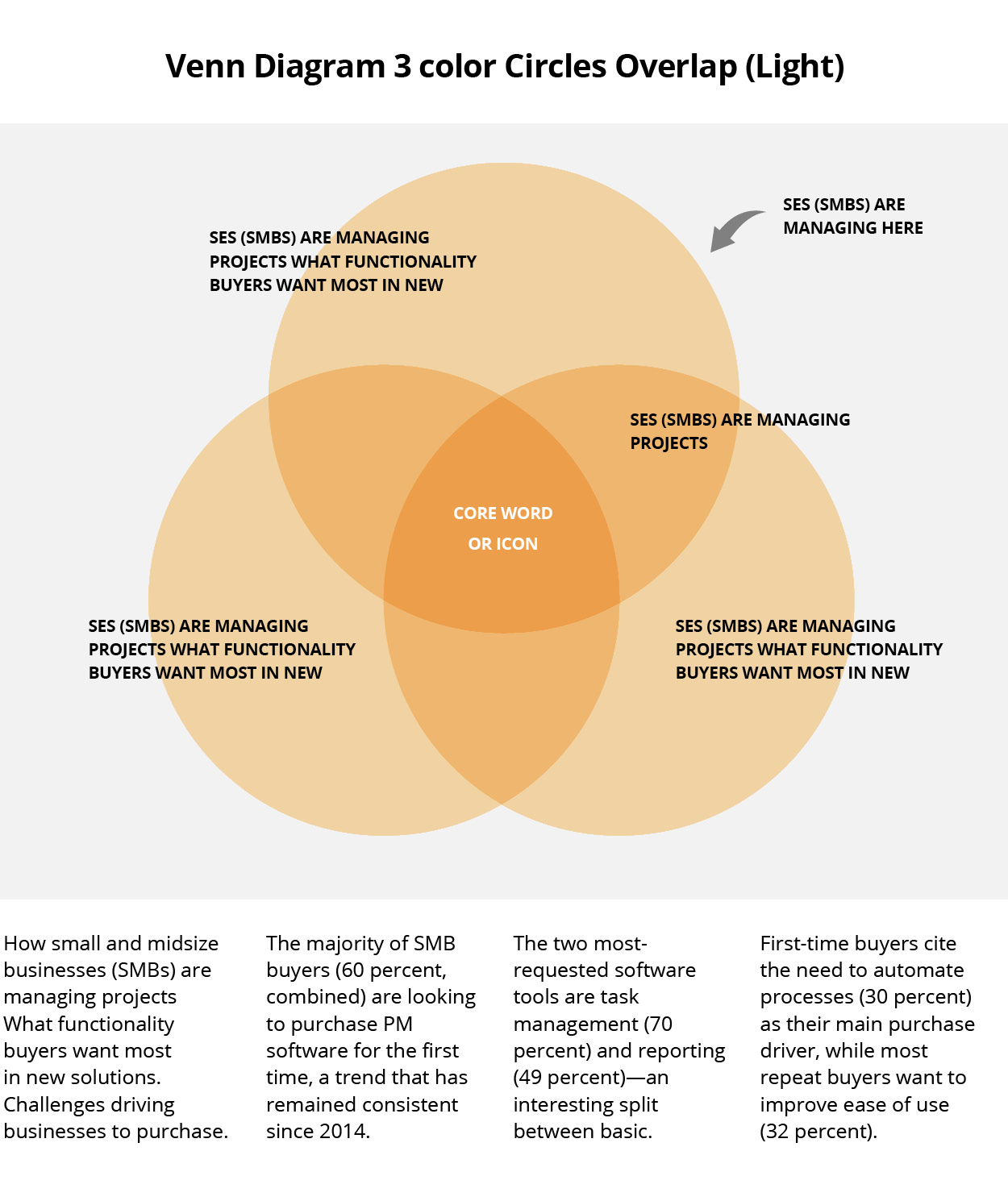
Venn Diagrams
Logo Garden
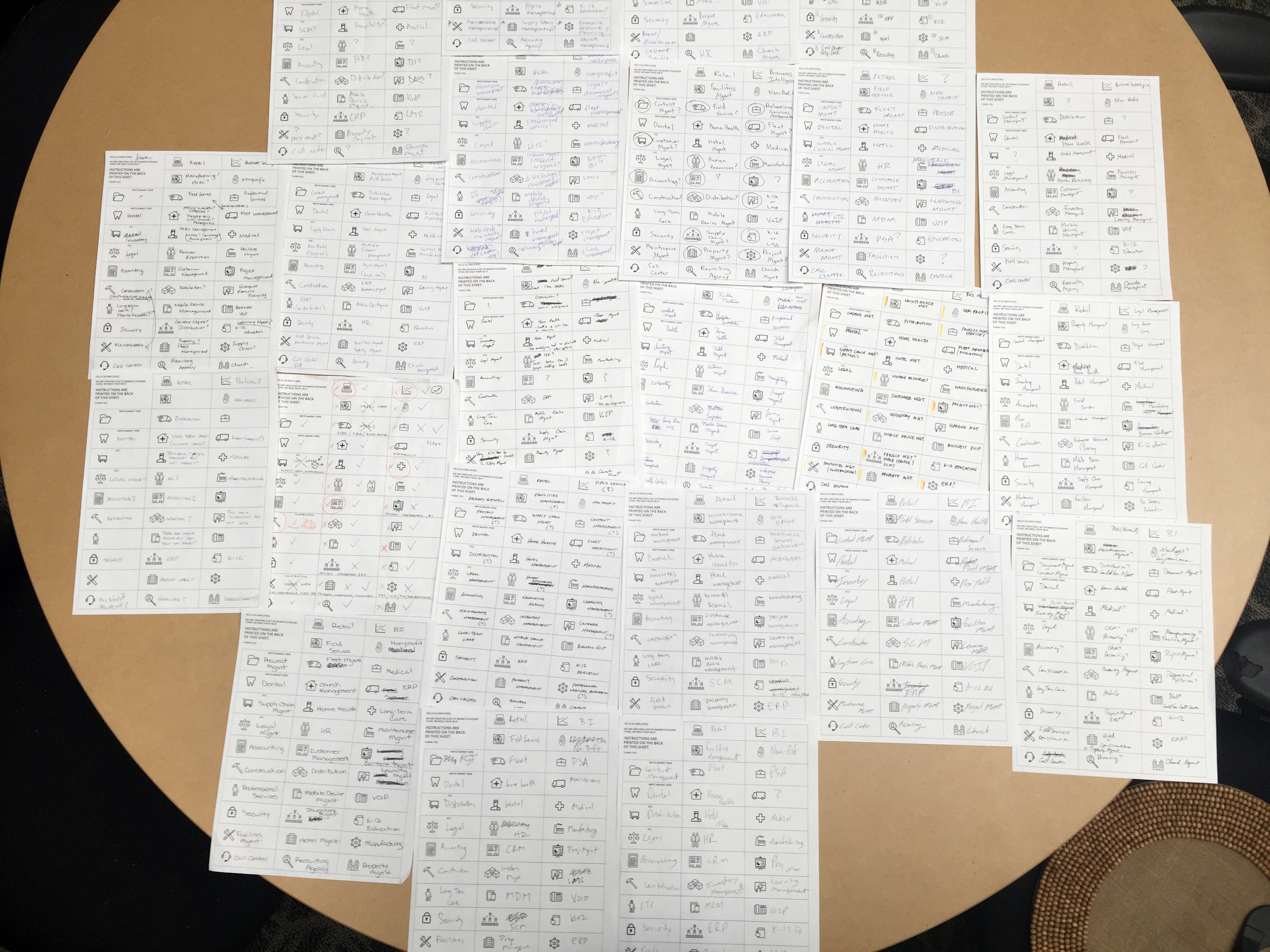
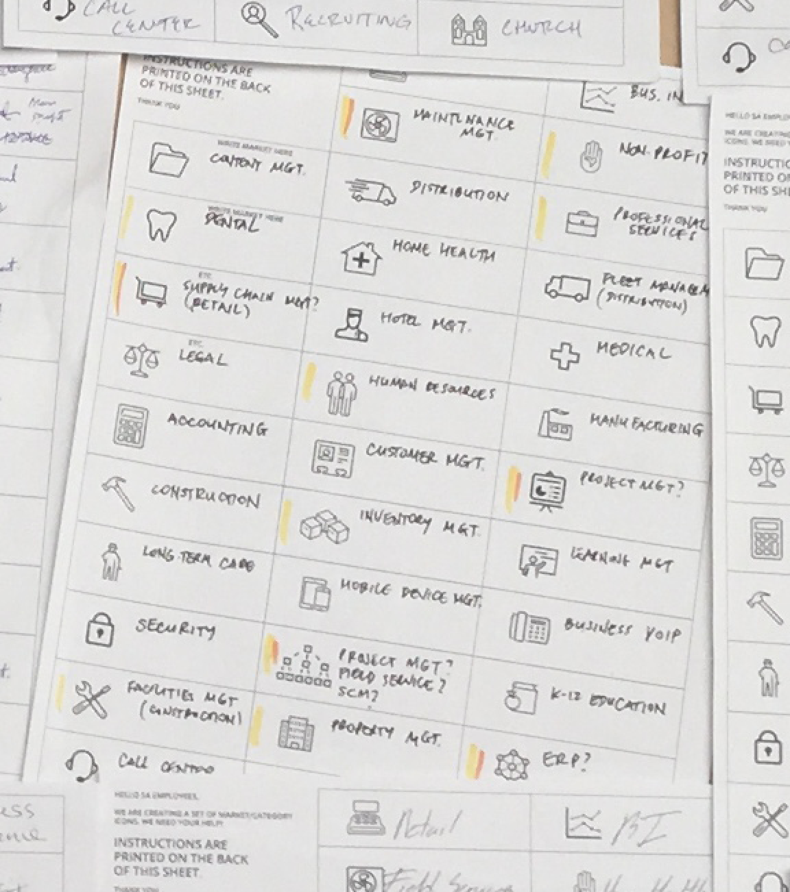
Market Icons
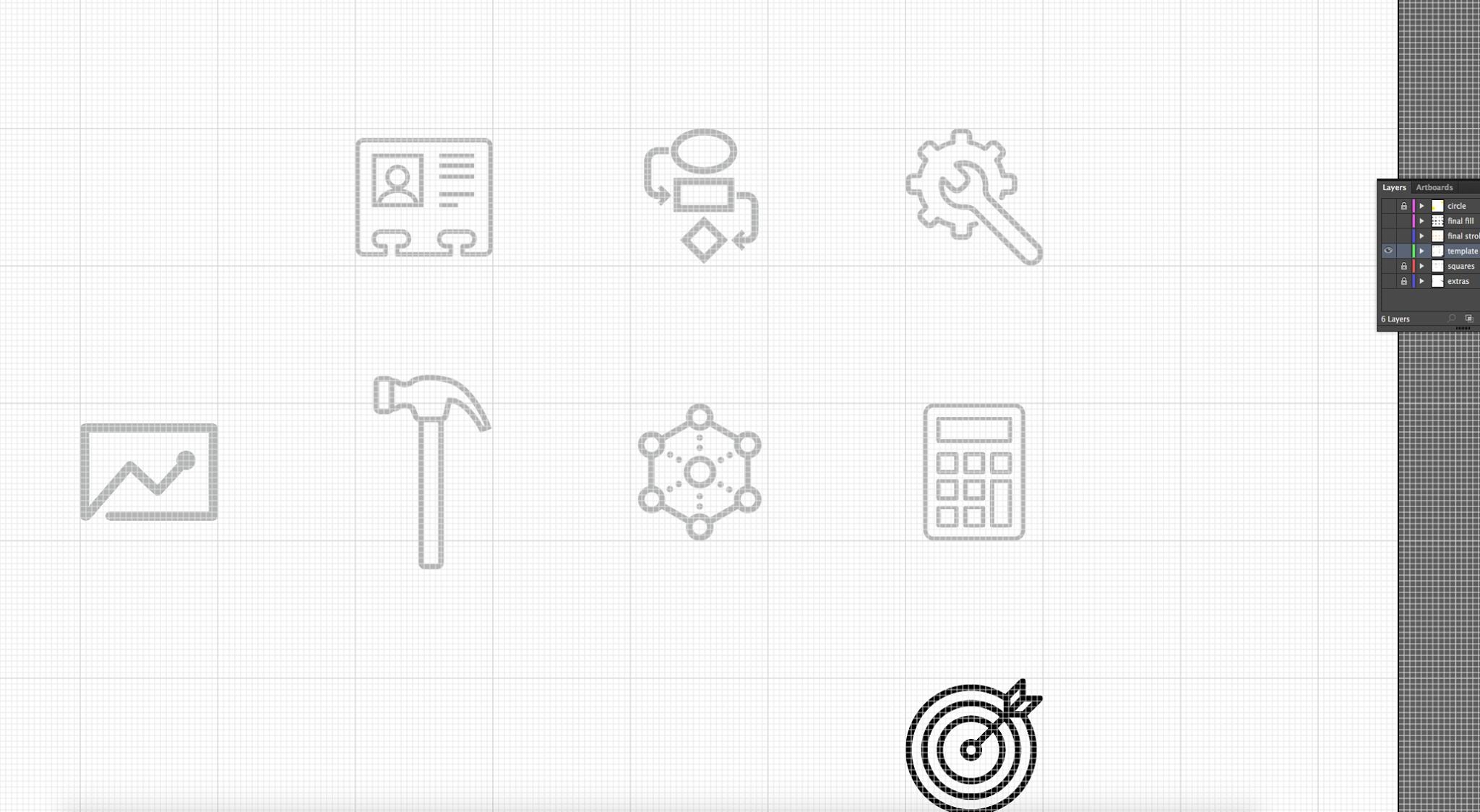
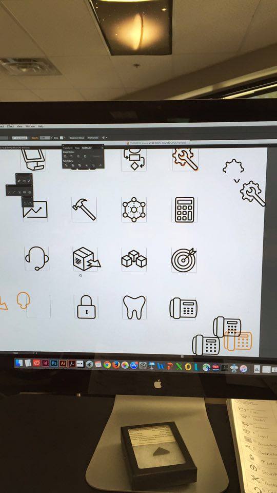
These icons were created to represent each of the 30+ unique software markets that Software Advice represents. The icons were carefully constructed in illustrator with a rigid grid system, to ensure that they would appear with exactly the same line weight no matter what size or platform they were rendered in. Each of these icons was then placed in Icomoon as a dynamic data set that could be rolled out into the core website across markets.
A/B Testing
To ensure that the icons functioned from a user comprehension perspective, I created a system to test the icons amongst our team. I went through several rounds of revisions with coworkers, then printed out about 50 sheets with only icons, and the markets left blank. This was qualitative research into finding out how people would respond to the icons, and if they were working. Both iconic (object) and narrative (action) design techniques were employed in creating these assets.
Below are two screenshots of the grid system in place that was used to ensure consistent attributes of all the icons in the set. The same stroke parameters were used in illustrator to be sure that all lines fell on the grid, and that all strokes had the same angles, spacing, and edges.
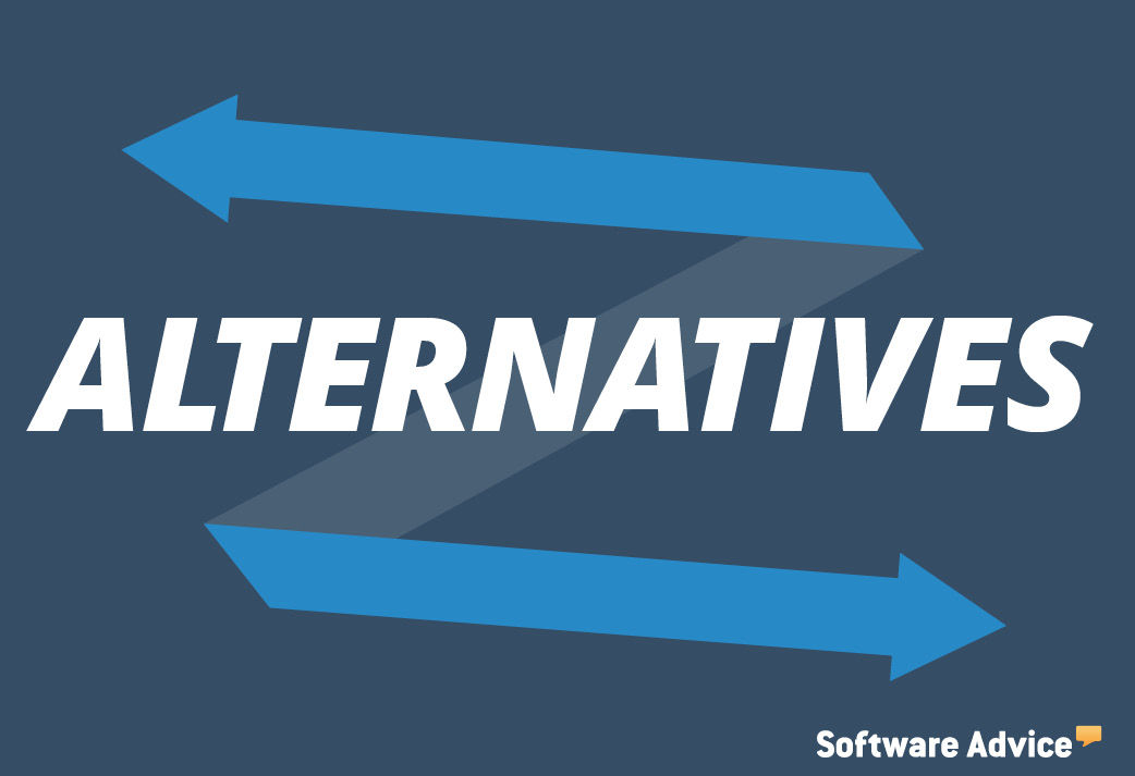
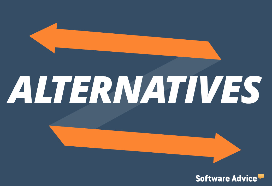
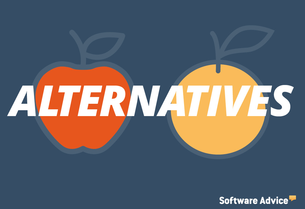
Infographics
Infographics are wildly popular forms of communication used in content marketing today, because of their easy to digest format and because of how sharable they are amongst today's viewers. These examples were created at Software Advice.
Click here to see all of these infographics in a separate case study.


Social Media Headers
The company was using a patchwork of photographs to promote their content across social media platforms. After implementing the new tile images, I created these header images for all popular platforms using the new icons set.

Custom social media headers were created for Facebook, Google+, Linkedin & Twitter.
Social Media Assets


Brand Style Guides
As a company with over 165+ people (with additional offices in India & Argentina), Software Advice was in desperate need of a cohesive visual design system. During my 7 months with the company I was able to create a Brand Style Guide that could serve as a unified system & structure for the visual identity of the company, as well as work as a legacy project moving into the future. This project is an important tool for employees as well as new members that would be added to the team later. Several pages of examples are posted below, or you can open the style guide here.
Grid System

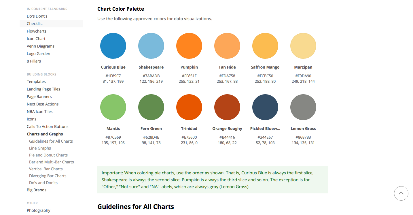
Branded Color Swatches
Rules for Imagery

Date completed: 2015-2016
Client: Software Advice
Location: Austin, Texas
Visual Design: Tyler Johnson
Lead Project Management: Taylor Stockwell
Hub Management: Janna Finch
UI/UX: Rob Hoyt
Front End Development: Graham Lambertson